Nexstera Tech
Designed a website for Nexstera Tech, a lithium-ion battery company, helping secure $65K in investment funding.
INTRODUCTION
How might we design a website that builds investor trust while educating the public about safe lithium-ion battery disposal?
Nexstera Tech is a climate-tech startup using AI to detect lithium-ion batteries in waste facilities, reducing fire risk and improving safety.
As a UX Designer, I contributed to ideation and design system development, and mainly worked on the Education & Investor page, shaping how Nexstera communicates its mission, credibility, and business value. I worked closely with designers, project managers, and Nexstera’s founding team to align design decisions with funding and growth goals.
The final design contributed to $65,000 in seed funding and a significant increase in investor engagement.
PROBLEM BACKGROUND
PROBLEM IDENTIFICATION
USER RESEARCH
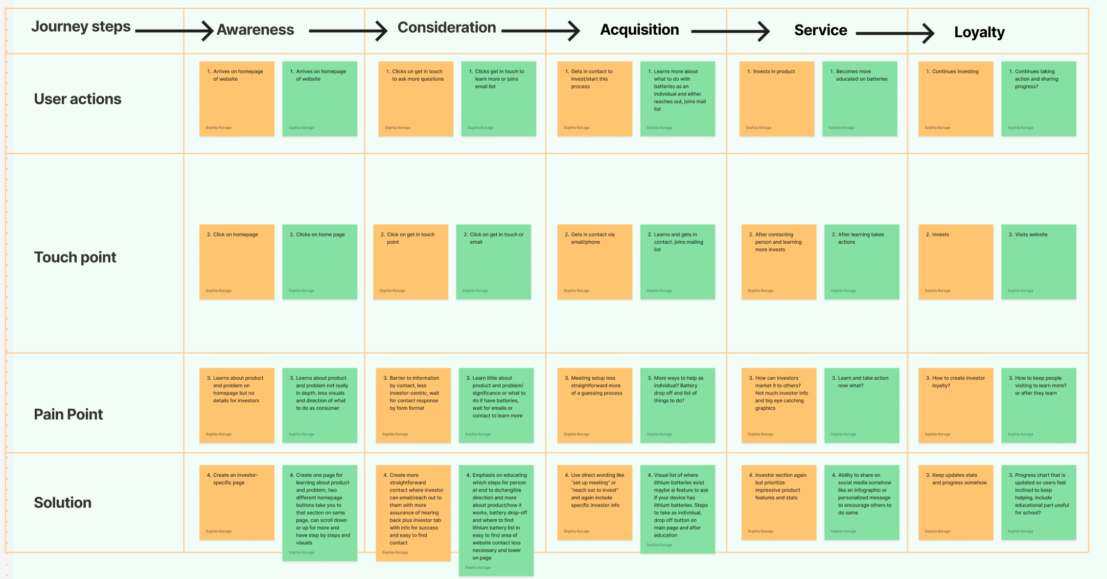
Journey Mapping
Competitive & Market Analysis
UX & Content Audit
KEY INSIGHTS
My Role
UX Designer
Team
5 UX designers, 2 project managers, and Nexstera’s founding team
Timeline
January 2024 – March 2024 (8 weeks)
Tools
Figma, Illustrator, Miro
A Canadian battery recycler active in the U.S., focusing on recovering more than 95% of materials from spent lithium batteries using shredding and chemical leaching, aiming to minimize waste and environmental impact
Battery Recyclers of America
Understanding the Problem
Improper disposal of lithium-ion batteries in waste facilities leads to fires, equipment damage, and millions of dollars in losses annually, posing serious safety, environmental, and financial risks. As lithium-ion batteries become increasingly common, waste management systems struggle to reliably detect and remove them before they enter processing facilities.
Nexstera Tech addresses this challenge through Pyrotack, an AI-powered detection system that identifies lithium-ion batteries before they cause harm. However, as an early-stage startup, Nexstera faced the challenge of communicating this complex technology in a way that builds investor trust while remaining accessible to the public.
Our goal: design a clear, credible, and engaging digital presence that effectively communicates Nexstera’s mission.
Improper disposal of lithium-ion batteries poses millions of dollars in risk, and Nexstera needed a website to bring awareness to this.
Their existing site struggled in three key areas:
1. Lack of Investor Resources
The site had no dedicated investor page, making it difficult to showcase traction, business value, and funding potential.
2. Missing Educational Content
Lithium-ion battery technology is widely misunderstood, yet the site offered little educational material to inform users and build trust.
3. Weak Design Foundation
Inconsistent design, poor hierarchy, and limited polish reduced brand credibility and user confidence.
Together, these issues limited Nexstera’s ability to educate users, convert interest into action, and build investor trust.
Let’s dive deeper into the data.
To empathize with our users, we mapped the journeys of both an investor and a curious visitor
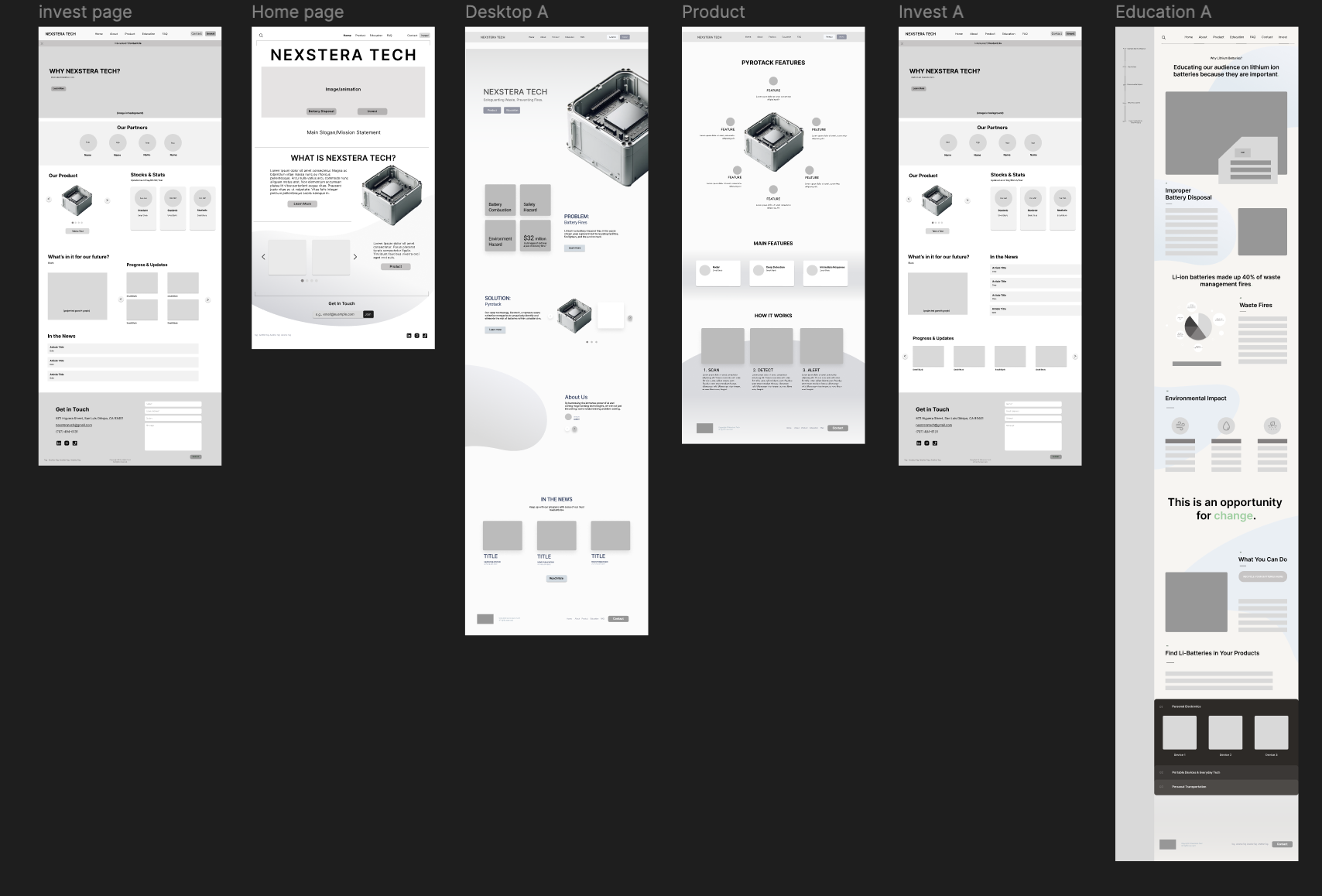
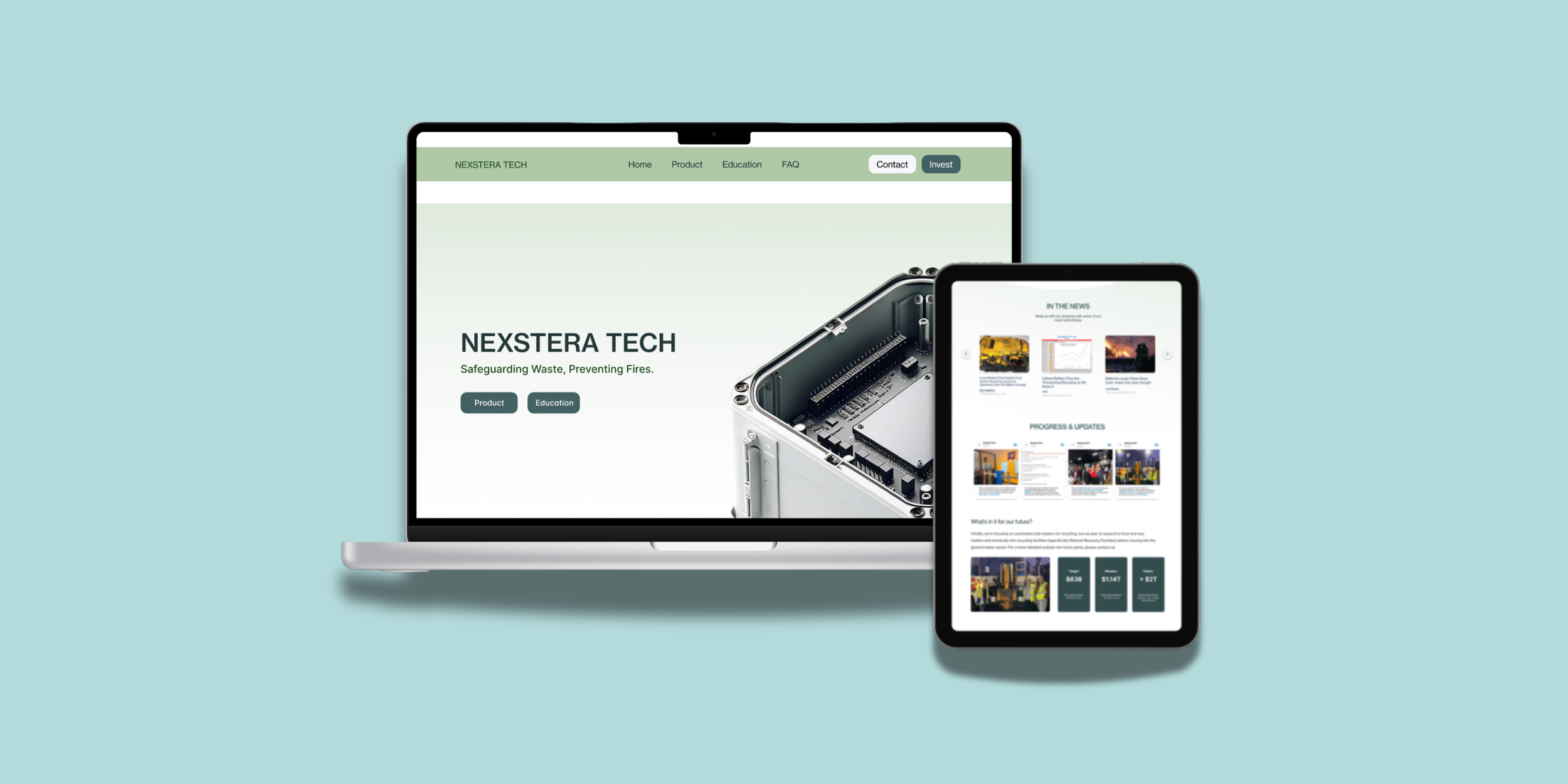
FINAL DESIGNS
Completed Prototype
Analyzed 6 competitors in the battery and sustainability space to understand effective patterns in layout, tone, and content.
Nuvola Tech
Offers SafeCoat™ DDS, a spray-on battery separator platform that improves safety, energy density, and manufacturing efficiency.
Li-ion Tamer
Provides advanced off-gas monitoring technology to prevent lithium-ion battery thermal runaway, offering up to 30 minutes of early warning.
Li-Cycle
A battery recycling provider in the U.S. that collects and processes various types of batteries, including lithium‑ion, to recover materials, reduce waste, and support safer disposal infrastructure.
Conducted a full audit of Nexstera’s existing web content and user flow to identify areas for simplification
Key Opportunities
Content – Make the site more engaging, concise, and credible by simplifying text, adding personality, visuals, and catchphrases, and highlighting media coverage.
Structure – Improve navigation and organization with clear actions, dedicated pages for battery types, step-by-step processes, FAQs, and dropdown menus.
Design – Adopt minimalistic layouts with purposeful visuals, credible graphics, and videos to clearly communicate product functionality without confusion.
After conducting our research, we concluded 3 key insights:
SOLUTION
DESIGN PROCESS
Users prioritize clarity over complexity
Technical depth is only valuable if it’s understandable. Simplified storytelling outperformed dense explanations.
Investors require a dedicated journey
They need fast access to traction, credibility, product value, and contact pathways.
Competitor differentiation is critical
Strong visual identity and brand storytelling significantly impact trust and perceived legitimacy.
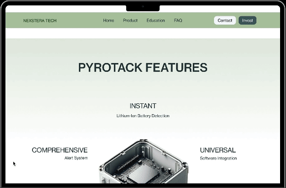
Introducing… Nexstera Tech’s new website!
A modern, investor-ready platform designed to balance technical depth, clarity, and credibility, creating a seamless experience for both investors and the public.
Key Features
Dedicated Investor Page – Clearly presents traction, Pyrotack’s value, and business potential to support funding efforts
Educational Content Hub – Simplifies technical concepts and builds public awareness and trust
Streamlined Product Storytelling – Translates Pyrotack’s technical functionality into accessible, engaging narratives
Modular, Scalable Design System – Ensures visual consistency and long-term adaptability
Clear Calls to Action & Engagement Pathways – Drives user flow from awareness to inquiry and conversion
IDEATION
Creating the blueprint for the designs
Started transforming concepts into tangible ideas, exploring features, refining layouts, and iterating through sketches.


Here are some of my sketches + ideas

Bringing the idea to life
Design System
Created a design system featuring a sleek color palette of cool greens to reflect sustainability and innovation.
IMPACT
Completed Prototype
Redesigning the website contributed directly to measurable business results:
$65,000
secured in investment funding
120%
increase in page engagement
A technology provider supplying industrial infrared systems for battery production processes, improving manufacturing efficiency and material quality rather than end‑of‑life safety or detection.
40%
reduction in navigation friction
The redesigned experience significantly improved brand credibility, investor confidence, and storytelling clarity.

REFLECTION