Product Design · UX Research · AI Platform
Microsoft Foundry
Models
Microsoft Foundry's catalog had grown past 11,000 models with no reliable way to find or compare them. Our team of five redesigned discovery around the decisions developers actually make. Our research and design work produced a set of recommendations for the team to take the page significantly further. Region filtering, one of them, is on the live site today.
The Problem
11,000 models,
and nowhere to start.
A developer who wants to ship this week opens the Models page and hits 11,000+ models. Users kept asking for the same two things: help me narrow this list, and help me know where to start. Some picked a model and only hit the wall at deployment, because it wasn't available in their region.
Our team of five spent three months redesigning model discovery end to end. I came to the project from the research side, after running a UX research study on Foundry.
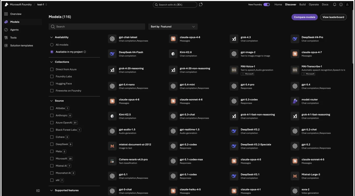
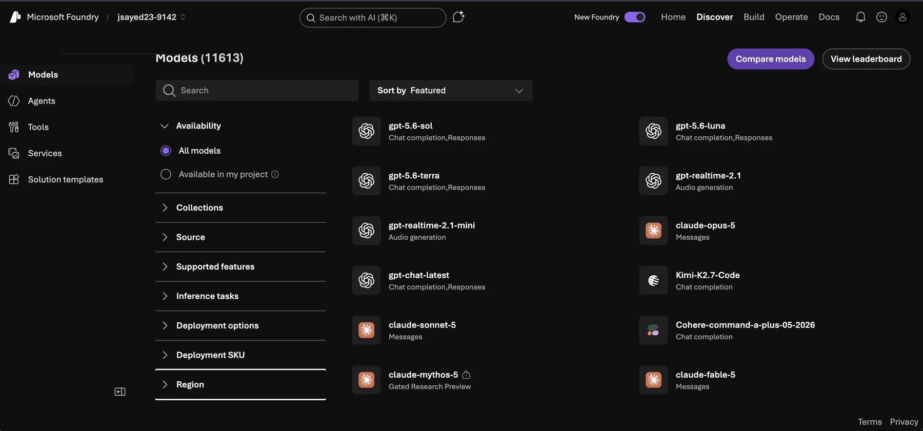
Toggle between the old catalog and the live Models page today. Before: a dense multi-column grid where every model shows little more than a name and a task, with no way to narrow by region, so a developer could commit to a model and only hit a wall at deployment. After: Region is promoted into the filter rail as a first-class way to narrow the catalog, in a cleaner, more scannable layout, with Compare a click away.
User Research
Developer interviews shaped
our direction.
The methods converged on three gaps: unclear terms, dense structure, and no way to compare.
We ran our own study: a heuristic evaluation of the live platform, moderated developer interviews, and a card sort.
- Unclear terminology
- Dense information structure
- High cognitive load
- Lack of onboarding support
- Comparing models meant too much clicking back and forth
- Lost their place navigating a large catalog
- Users needed key model details earlier in the flow
- Explored how users group and organize information
- Revealed confusion around similar model tasks
- Guided the creation of our information architecture
Who we designed for
Research pointed to three personas: Maya, a student developer; Priya, a PM weighing cost against capability; Alex, a startup developer. After aligning with Microsoft we designed primarily for Alex, who needs to move fast without picking a model that causes problems later.
“I want to move fast without picking a model that creates problems down the road.”
Sketches & Wireframes
Sketching our way
out of the problem.
Two decisions drove the redesign: where the region problem gets solved, and what a developer sees first.
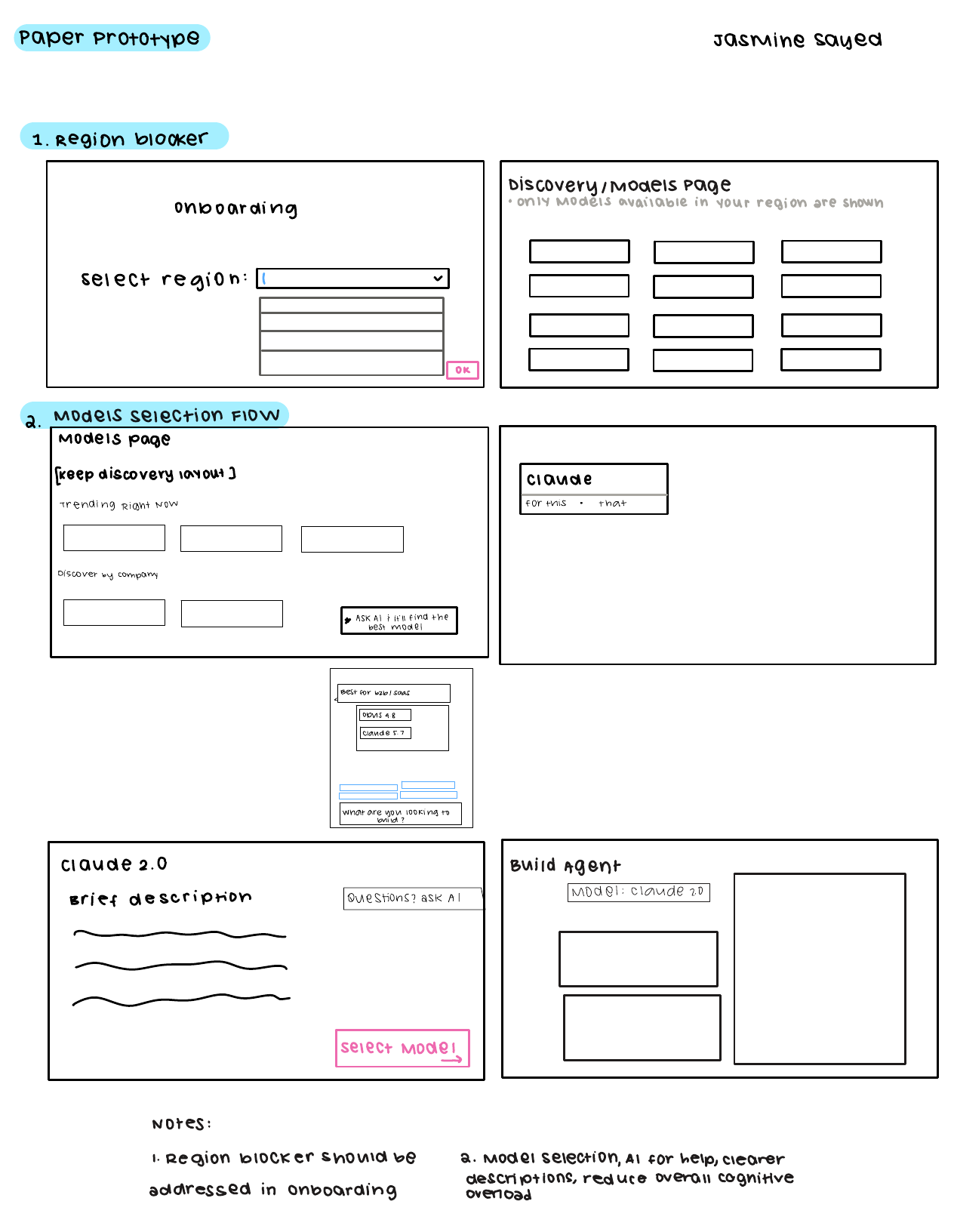
Paper prototype. Two ideas we carried forward: handling region up front so a developer never commits to a model they can't deploy, and a model-selection flow with an “ask AI” helper and clearer descriptions to reduce overload.
Three things the wireframes had to solve:
Designing for the states that aren't the happy path
A catalog of 11,000 models is mostly edge cases. Three shaped the design as much as the main flow, each a decision with a real trade-off.
Three directions I killed
With a fixed IA and a tight scope, the hard part was deciding where not to spend the effort. The final answer looks obvious in hindsight; it wasn't. I explored three approaches that tested worse, and killing them is what made the final design defensible.
Mid-fidelity wireframes
With the structure settled, I moved into Figma. These mid-fidelity screens worked out where each decision lives; the clickable high-fidelity build comes next.
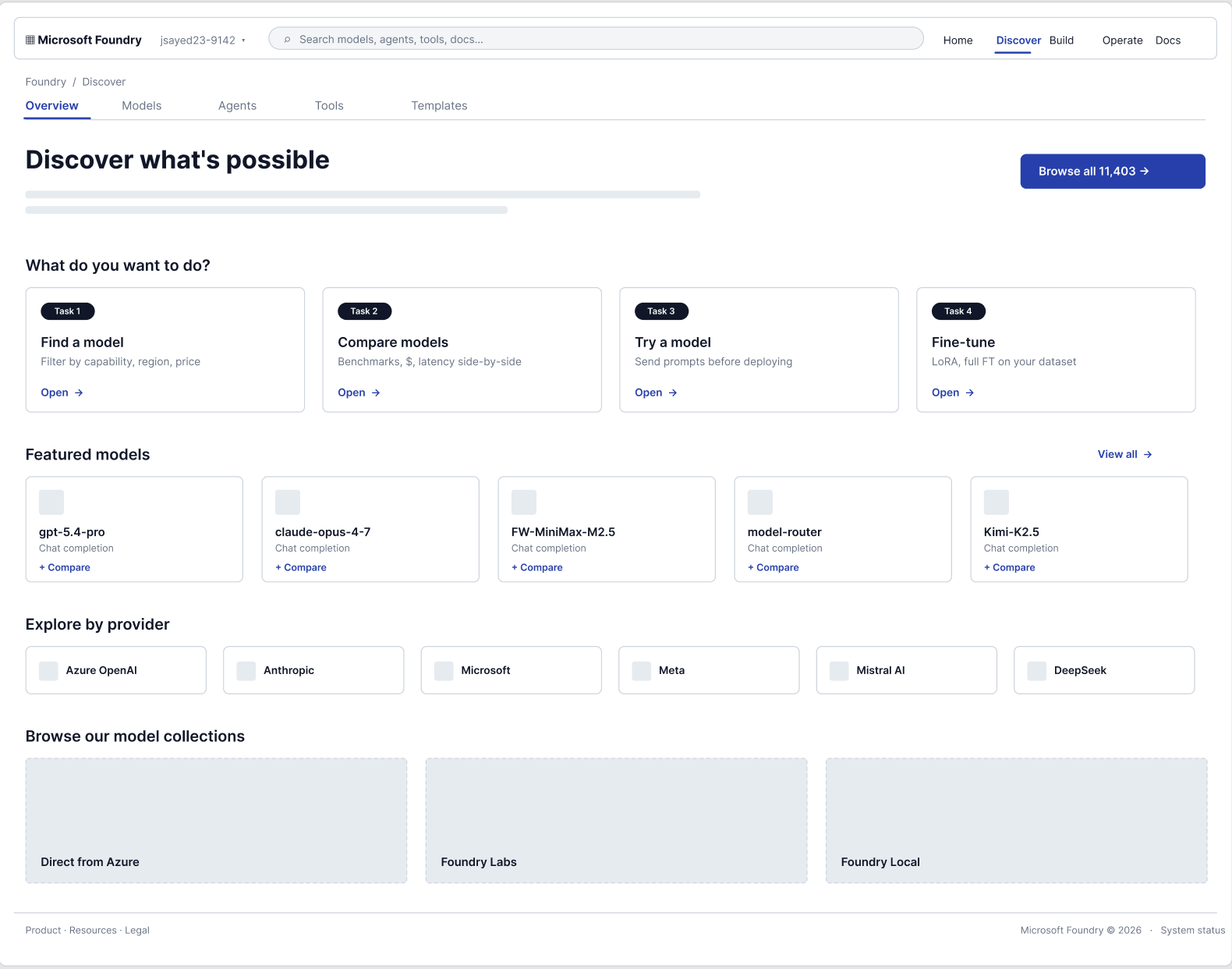
Discover: a front door with intent
Instead of an 11,000-row wall, Discover opens with what you're trying to do: find, compare, try, or fine-tune a model.
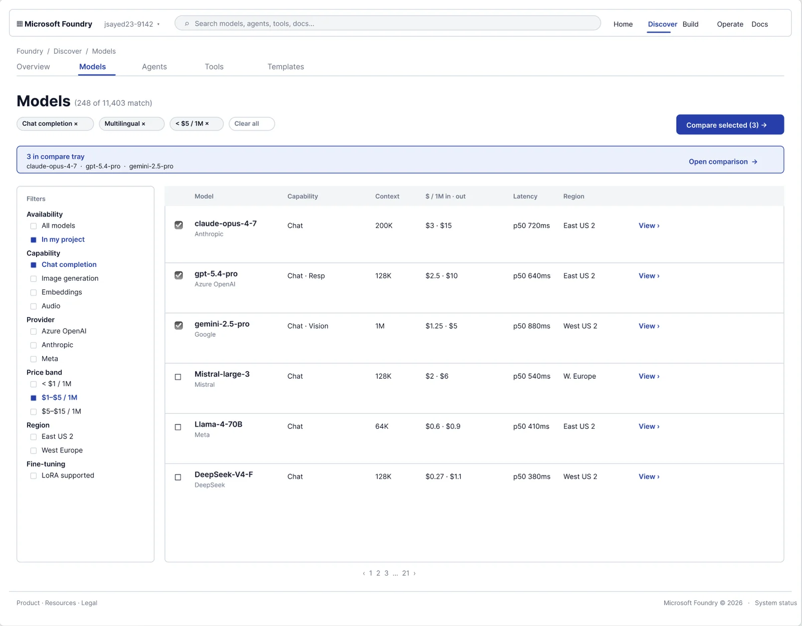
Models: filter, region, and compare in one place
The core of the redesign: a filter rail narrows 11,000+ models, region and pricing sit right in the results, and a compare tray collects models for a side-by-side decision.
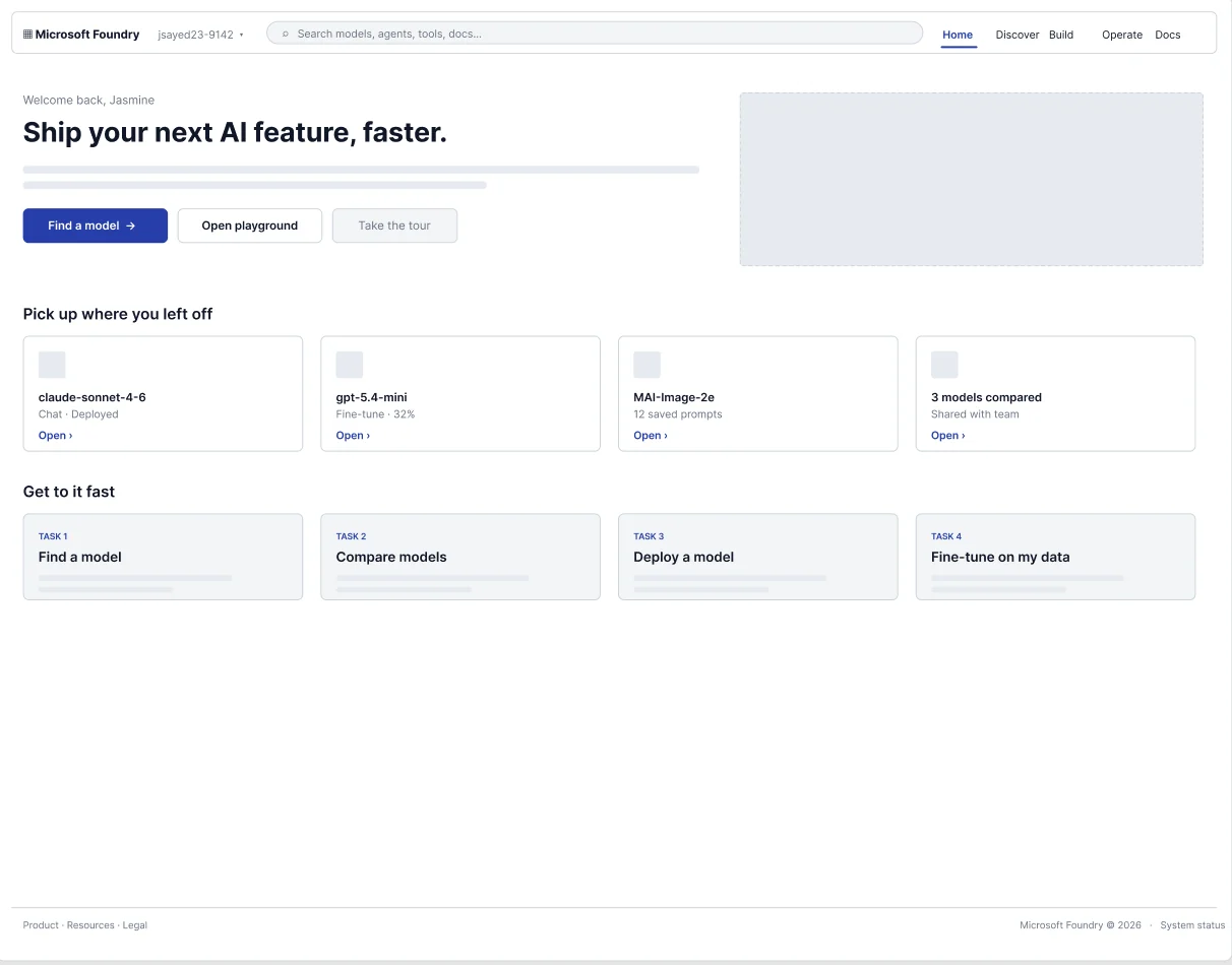
Home: pick up where you left off
Returning developers land on recent models and quick tasks, so a half-finished decision doesn't mean starting the search over.
High-Fidelity Prototype
The clickable, high-fidelity build.
Every recommendation was argued in a clickable build first, not a static deck.
Interactive Walkthrough
Recommendations
Two changes, argued through design.
Our team took two recommendations through research and design. The first promoted Region into the filter rail, so developers narrow the catalog by where a model can actually deploy, before they commit rather than after they hit a wall. The second deepened compare, a feature the platform already had: we proposed surfacing pricing and regional availability inside the comparison and calling out a recommended pick, so the trade-off is legible instead of something you reconstruct yourself.
Region filter live in Microsoft Foundry · Discover › ModelsUser Testing · Round 2
Validating the high-fidelity
prototype.
An earlier round on the wireframes shaped the layout. This one put the high-fidelity prototype in front of 6 developers, each working the flow as though they were choosing a specific model to build their agent on: could they understand it, navigate to the right region and model, and compare options to find the best fit? Search-to-select is the time from starting the flow to committing to a model.
Three refinements: region and pricing moved to the top of each card so they register before anyone opens a model, compare became a persistent tray with a running count, and the best value in each row got called out. Directional signals from a moderated round of 6, enough to steer the design, not to claim significance.
Results
The recommendations
we put forward.
The redesign reframed discovery around the decisions developers make: narrowing, evaluating, committing. Our research and design work put two recommendations in front of the team: make region a first-class filter, and deepen compare. I ran the research and led the concept and IA on both.
Task-success is the design metric; the funnel is why Foundry cared. Two things leaked developers out of browse › select › deploy: picking a model unavailable in their region, and stalling in evaluation because comparing meant opening models one at a time. Region-in-filters removes the first; compare shortens the second. Both aim at models successfully deployed.
Earlier in the Microsoft-sponsored project: I ran the usability research for Foundry's Agent Builder, where 8 of 8 developers hit the same blocker, a usability catastrophe on Nielsen’s severity scale, turning a deprioritized bug into a prioritized fix.
Read that study →Takeaways
What I took away.
Thanks for reading
Let’s talk.
My one-page resume, or reach me directly.